Next.jsでMDXのコードブロックをリッチにする
2026-03-15
今回は、Next.jsでMDXのコードブロックにシンタックスハイライトを適用します。
使用技術
- Next.js
15.5.2- Turbopackは使用していません
- MDX
- Next.jsでの詳細な使用方法はこちらをご覧ください
- Tailwind CSS
- shadcn/ui
- rehype-pretty-code
- その他プラグイン
実装
まずはNext.js公式の手順通りにMDXを導入します。
npm install @next/mdx @mdx-js/loader @mdx-js/react @types/mdxMDXをきれいに表示するツールたちとシンタックスハイライトを適用するために、以下のパッケージをインストールします。
| プラグイン | 役割 |
|---|---|
| rehype-pretty-code | シンタックスハイライト |
| remark-gfm | GitHub Flavored Markdown |
| react-children-utilities | Reactの子要素を操作する |
| @tailwindcss/typography | Tailwind CSSのTypographyプラグインで、MDXのスタイル調整 |
npm install rehype-pretty-code remark-gfm react-children-utilitiesnpm install -D @tailwindcss/typographynext.config.tsをnext.config.mjsに変更し、以下のように設定します。
import createMDX from "@next/mdx";import rehypePrettyCode from "rehype-pretty-code";import remarkGfm from "remark-gfm";
/** @type {import('next').NextConfig} */const nextConfig = {  pageExtensions: ["js", "jsx", "md", "mdx", "ts", "tsx"],};
/** @type {import('rehype-pretty-code').Options} */const options = {  // ここでテーマを指定できる  theme: "dark-plus",};
const withMDX = createMDX({  options: {    remarkPlugins: [remarkGfm],    rehypePlugins: [[rehypePrettyCode, options]],  },});
export default withMDX(nextConfig);
設定できるテーマ一覧
プロジェクトルートにmdx-components.tsxを作成します。
import type { MDXComponents } from "mdx/types";
const components: MDXComponents = {};
export function useMDXComponents(): MDXComponents {  return components;}
Tailwind CSSのTypographyプラグインも忘れず設定します。
@import "tailwindcss";@import "tw-animate-css";
@plugin "@tailwindcss/typography";
/* ...省略 */親要素にproseクラスを追加するとMDX要素がキレイに表示されます。
// ...省略
return (  <html lang="ja">    <body className={`${geistSans.variable} ${geistMono.variable} antialiased`}>      <div className="prose">{children}</div>    </body>  </html>);
これで、コードブロックにシンタックスハイライトが適用されるようになります。
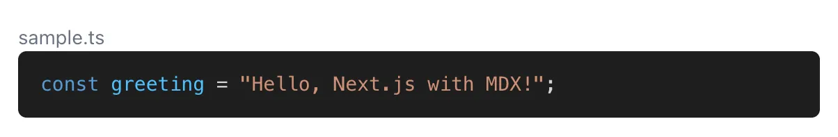
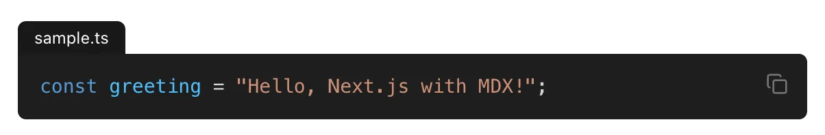
あとは、mdx-components.tsxでコードブロックのスタイルを調整したり、コピー機能を追加したりしていきます。
まずは、コピーボタンを作ります。
ボタンがクリックされたら、propsで渡されたテキストをクリップボードにコピーし、2秒間チェックマークを表示するようなコンポーネントです。
"use client";
import { Check, Copy } from "lucide-react";import { useState } from "react";import { cn } from "@/lib/utils";// shadcn/uiのButtonコンポーネントを使用していますimport { Button } from "./ui/button";
export default function CopyButton({  text,  className,}: {  text: string;  className?: string;}) {  const [isOk, setIsOk] = useState(false);
  return (    <Button      size="icon"      variant="ghost"      className={cn("relative hover:bg-accent/10", className)}      onClick={() => {        setIsOk(true);        setTimeout(() => setIsOk(false), 2000);        navigator.clipboard.writeText(text);      }}    >      <Check        className={cn(          "-translate-x-1/2 -translate-y-1/2 absolute top-1/2 left-1/2",          "text-muted-foreground transition-opacity duration-300",          isOk ? "opacity-100" : "opacity-0",        )}      />      <Copy        className={cn(          "-translate-x-1/2 -translate-y-1/2 absolute top-1/2 left-1/2",          "text-muted-foreground transition-opacity duration-300",          isOk ? "opacity-0" : "opacity-100",        )}      />      <span className="sr-only">コピー</span>    </Button>  );}
あとはコードブロックで使用される要素をカスタマイズしていきます。
import type { MDXComponents } from "mdx/types";// onlyTextはReactの子要素からテキストだけを抽出するユーティリティimport { onlyText } from "react-children-utilities";import CopyButton from "./components/copy-button";
export const components = {  figcaption: (props) => (    <figcaption      className="w-fit rounded-t-sm bg-primary px-3 py-1 text-primary-foreground text-xs"      {...props}    />  ),  pre: (props) => {    return (      <div className="relative">        <pre          className="mt-0 rounded-sm rounded-tl-none"          {...props}          tabIndex={-1}        />        <CopyButton          text={onlyText(props.children)}          className="absolute top-1 right-1"        />      </div>    );  },} satisfies MDXComponents;
export function useMDXComponents(): MDXComponents {  return components;}
完成!🥳